How do you create a data visualisation system that extends seamlessly across mediums?
overview
Data For India publishes original, research-backed, data-informed insights on key socio-economic themes about India. This work is backed by publically available, globally trusted data sources. All of their work is published on permissable copyleft licensing to encourage sharing and reuse. Their mission: “Insights, charts and data to create shared knowledge and expand our understanding of India.”
problem
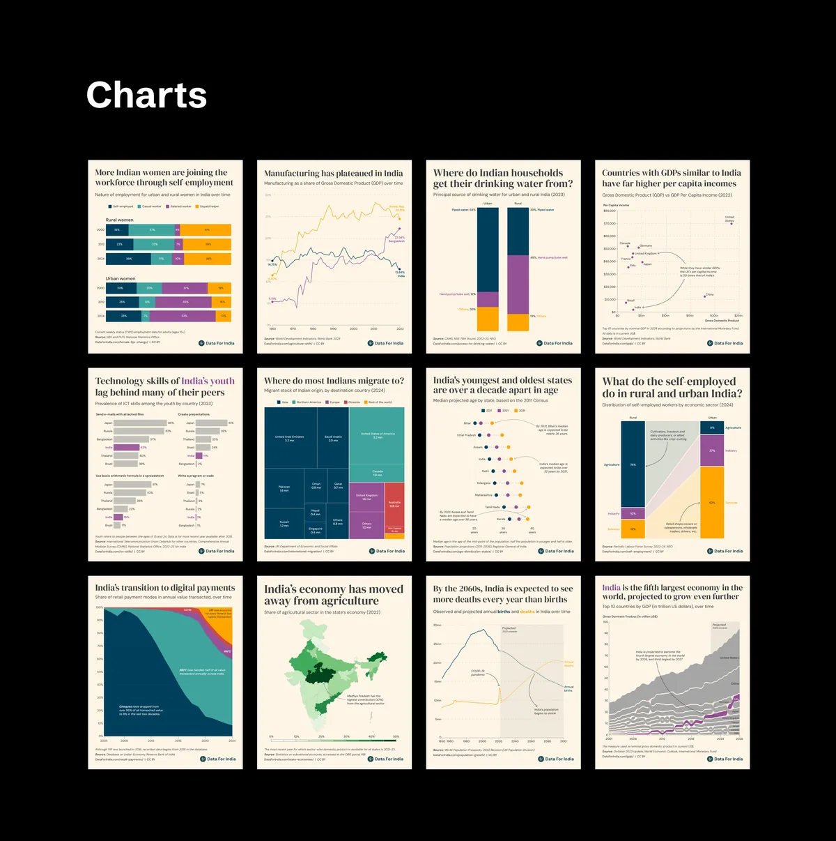
Over a year and two iterations, I led the evolution of Data For India’s charts from a standard out of the box output into a comprehensive data visualisation system. The initial system was web-first: it brought consistency and clarity to the website, but it didn’t translate well to off-platform use cases like presentations, displays, social media, etc. The visuals collapsed on small screens, layouts felt cramped, and the charts didn’t build strong brand recognition.
what i did
I led Data For India’s charts through two versions — from a coherent off-platform visualisation system to a comprehensive cross-medium design system spanning website, social, newsletters, presentations, and events.
highlights
Version 1 (off-platform first)
- Started from a simple constraint: charts needed to work outside the website without falling apart on small screens or in event contexts.
- Defined structure, hierarchy, typography, colour usage, spacing, and reusable layout defaults — turning standard outputs into a consistent, impactful system for social channels and events.
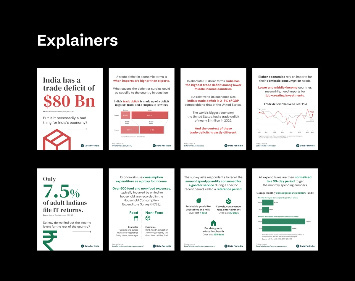
Version 2 (comprehensive design system)
- Set up the strategy backbone — Evaluation Criteria, Selection Guide, and Publishing Guide — the tools that made the system measurable, repeatable, and transferable across the team.
- Partnered with Tibba Design Studio to unify previously split web and social approaches into a single visual system that holds across website, social, newsletters, presentations, events, and more.
impact
- Reduced rework when adapting charts across channels by shifting from one-off resizing to reusable rules and formats.
- Improved consistency and speed through shared standards for review and QA of the data visualisations.
- Strengthened cross-channel brand recognition for Data For India’s original research and visual work.
team
Data For India
- Arpit Arora, Product Lead
- Rukmini S, Founder
External collaborators
- Tibba Design Studio, Version 2 design